

Neutral means that the background has no colour of its own to compete with the product and nothing in it to look at. It is a wider category than pure white: a pale grey wall, a sheet of beige paper or an evenly lit studio sweep all qualify, while a patterned cloth or a busy room does not.
Marketplace rules use the term in two ways. Some require pure white for the main image and say so in exact values. Others ask only for a light, neutral ground, which leaves room for grey or beige and suits white products better, because a white product on white loses its outline.
The choice is made per channel and then held: one neutral tone across a collection lets shoppers compare products instead of backgrounds. Where one image has to serve several marketplaces, the strictest rule decides, and that is usually pure white for the main image.
What makes a background neutral
In colour terms, neutral means low saturation: white, grey, off-white and the pale tints close to them, such as stone, putty or greige. Checked with the eyedropper of an image editor, a neutral tone shows nearly equal red, green and blue values. A warm neutral leans slightly towards red and yellow, a cool one towards blue, and the further the values drift apart, the more the background becomes a colour of its own.
The word means the same in portraits, profile pictures and ID photos: a plain, light, evenly lit ground without pattern that leaves all attention on the subject. For a product it adds one more point. A neutral background says nothing about where the product is, which is what separates it from a scene.
How light makes a neutral ground patchy or tinted
A background is only as neutral as the light on it. Uneven light shows as a gradient: brighter in the middle and darker in the corners, or one side lighter than the other. On a phone screen it can pass as a soft vignette; in a grid beside other listings it looks like a grey or dirty patch behind the product.
Distance matters as well. A product placed right against the background throws a hard shadow onto it, while a product moved forward leaves the ground darker, because less of the light reaches it. Coloured surfaces nearby, such as a red wall or a green curtain, tint a pale ground more than they tint the product, so the cast is easy to miss until the image stands beside a white page.
Light, dark and coloured neutrals
Black and charcoal are neutral in colour, but they are not what most sales channels mean. Where a rule asks for a neutral background it normally means a light one, and dark grounds are kept for the brand's own shop, campaign images or lookbooks, where they can give a range a deliberate, darker mood.
Within the light neutrals, the product's outline decides the tone. There has to be a visible step in brightness between the edge of the product and the ground. White, cream and clear glass products need a ground a shade darker than white; dark products need a ground light enough that their outline and their shadow both remain readable.
Neutral background and related terms
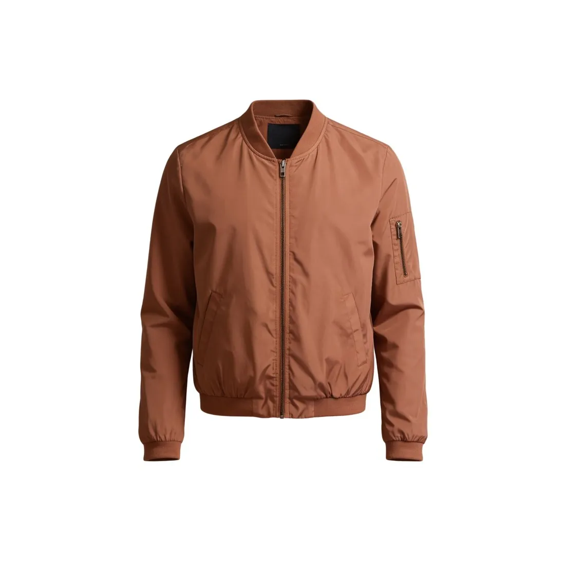 Pure white background
- A pure white background is one exact value: every pixel at the highest value in all three channels. A neutral background is a wider family that includes off-white, grey and beige, so an image can be neutral and still fail a rule that asks for pure white.
- Studio sweep
- This kind of backdrop is a way of building the background, not a colour: a sheet of paper or vinyl that curves from the wall onto the floor so that no horizon line shows. Most neutral studio grounds are made this way, in white, grey or a warm tone.
 Lifestyle image
- A lifestyle image shows the product in use or in a real setting, such as a room or a street. It is the opposite approach: the scene is meant to be looked at, and most marketplaces keep it out of the main image.
- Drop shadow
- A drop shadow is a soft shadow under a product on a plain ground. On a neutral background it keeps a cut-out product from looking as if it floats, and across a range it should fall in the same direction every time.
A checklist for a neutral background
- The background shows no pattern, texture, crease or edge at the size at which shoppers see the image.
- The eyedropper reads nearly equal red, green and blue values in every corner, so the ground has no colour of its own.
- The tone is even from edge to edge, with no dark corners, bright spot or gradient from one side to the other.
- The outline of the product stands clear of the ground, including its white, pale or transparent parts.
- Every product of the range was photographed on the same tone, in the same light and with the same shadow direction.
- Where the sales channel asks for pure white rather than a neutral tone, the main image was made on white and measured.