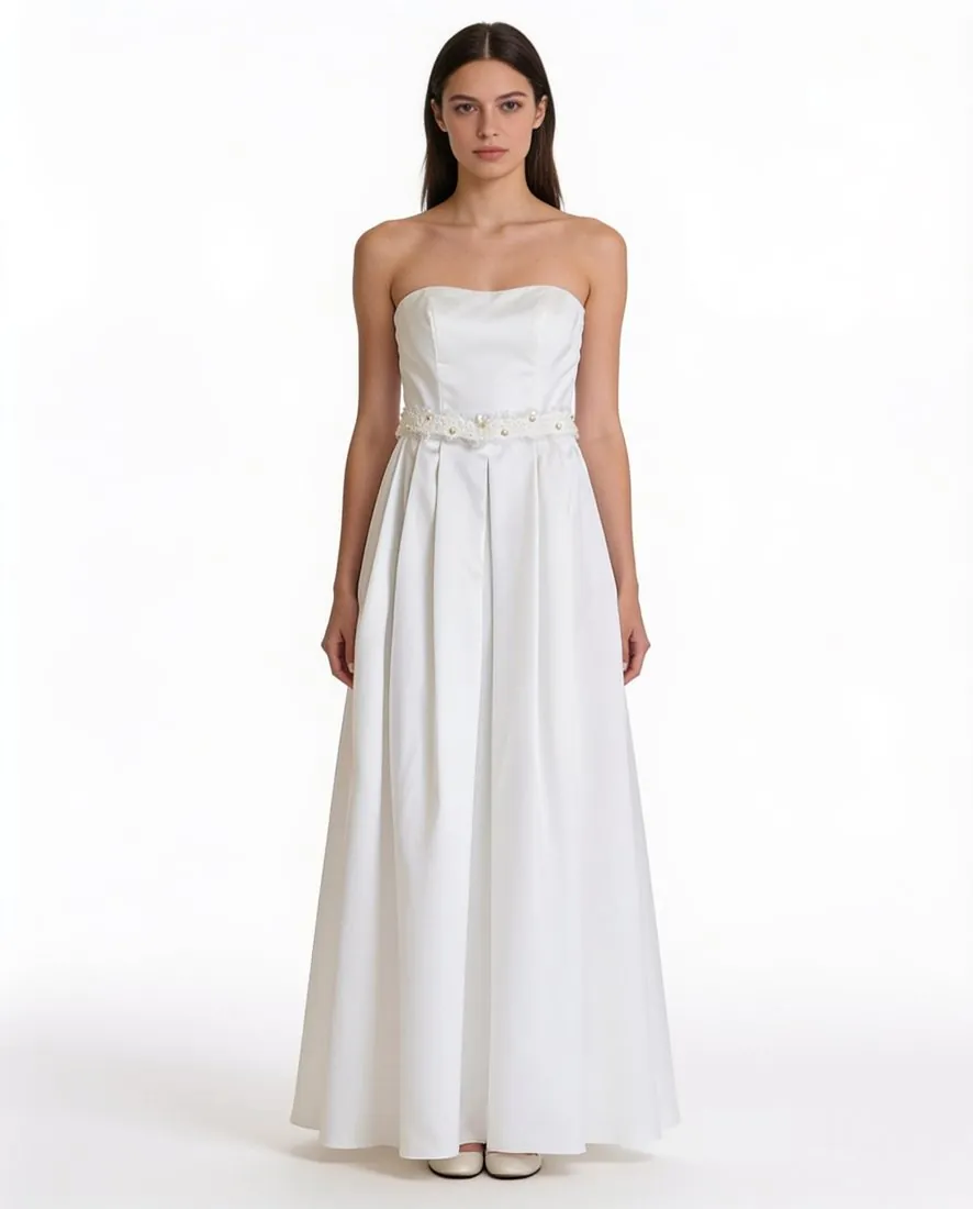
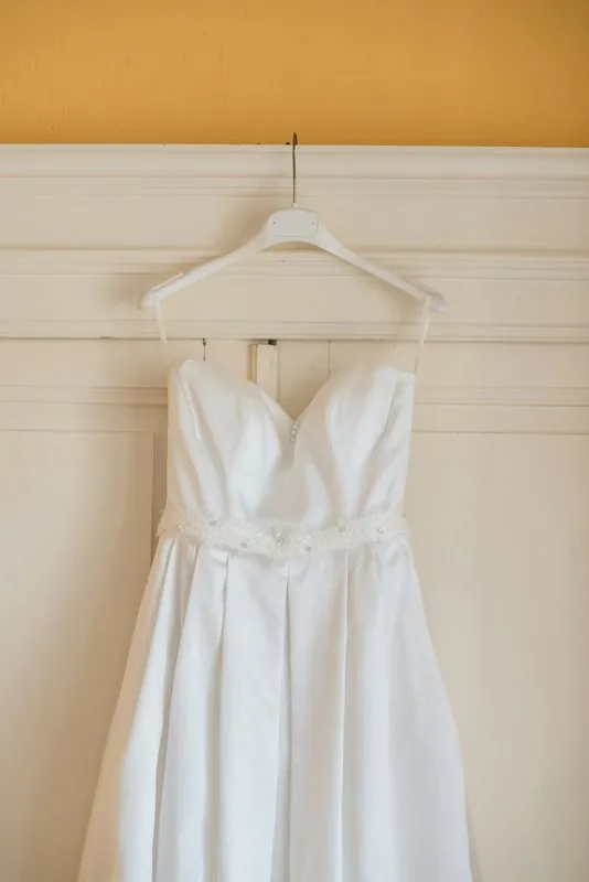
The order matters. White balance is set first, so that neutral areas are neutral; then brightness and contrast; only then the product's own colour, judged with the item held next to the screen in daylight. If one colour is still off, a selective adjustment of that hue alone fixes it without tinting the background or other products in the frame.
Some colours are hard for cameras. Navy and indigo tend to drift towards violet, saturated reds lose their texture, black fabric picks up a blue or brown tint, and two fabrics that match in one light can differ in another, an effect called metamerism. These are the colours to check one by one, and in a series of colour variants each variant is corrected against its own sample.
Correction aims at truth, not appeal. Raising saturation or warmth to make a product look richer creates a gap between the listing and the parcel, and that gap leads to returns. A photo recoloured to show another variant is checked against the real item too, since dyes and textures do not respond to light in the same way. The corrected file is then saved in sRGB so the result reaches the shopper unchanged.