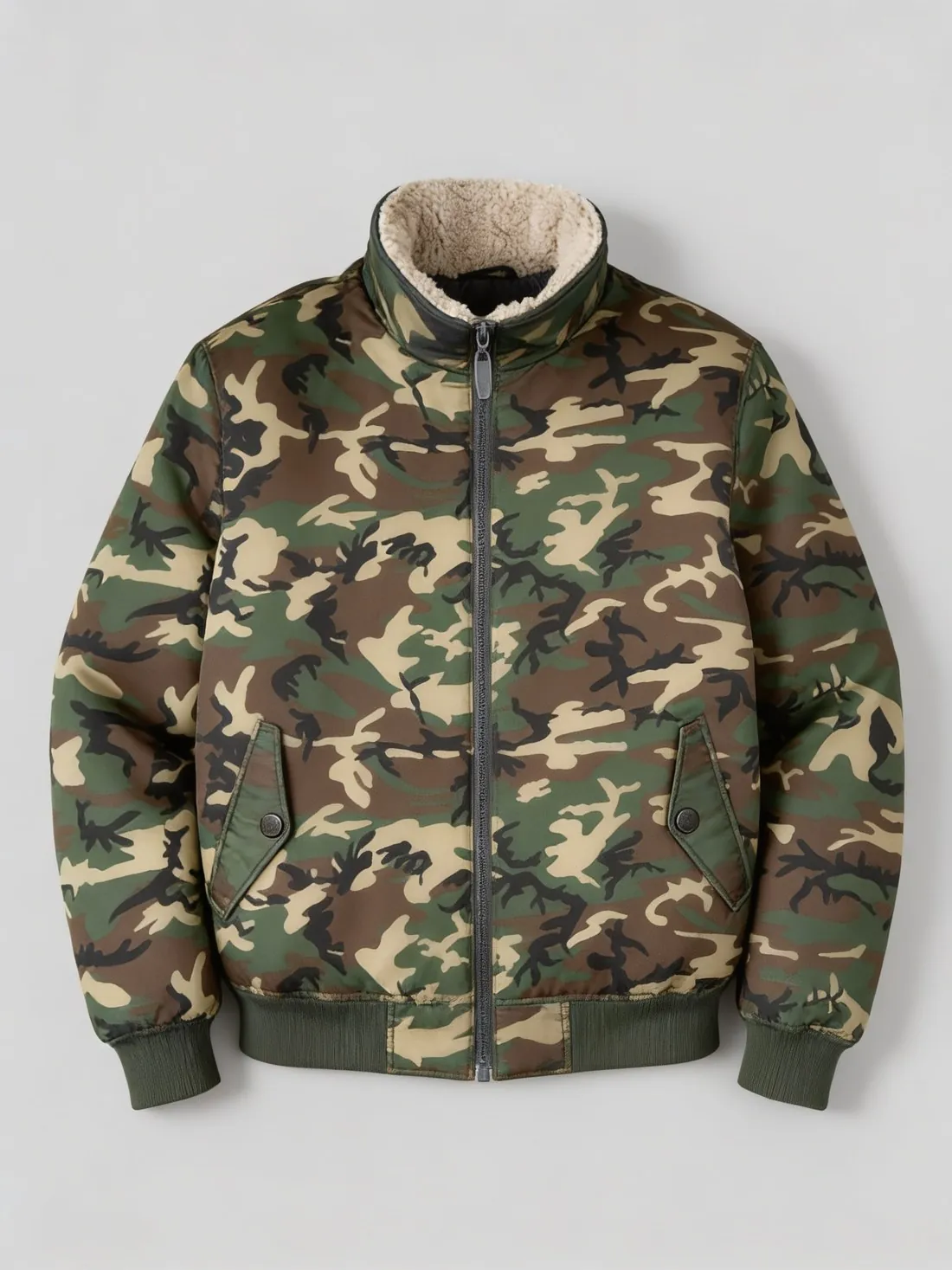
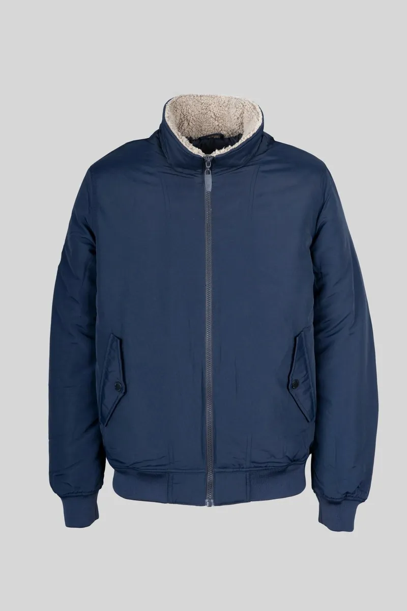
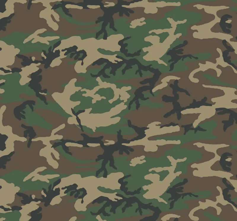
In a workshop a swatch is a cutting from the bolt, pinned to a card with its name and composition. Online, a swatch is a small square image beside a product, one for each colour or cloth on offer, that a shopper selects to change the variant. Both serve one purpose: to show the material apart from the garment.
A swatch image has to be true to the cloth: photographed flat, in even daylight, straight on and close enough to show the weave, with at least one full repeat of any pattern. A physical swatch remains the reference where the exact shade matters, because screens differ from one another and from the fabric.
Where swatches are used
Swatches travel in both directions along the supply chain. A mill sends them to a designer on a card that states the composition, the weight, the width and the colours on offer. A brand sends them to a customer wherever the cloth is chosen before the product is made, as in tailoring, upholstery and curtains.
Online the swatch has two jobs that are easily confused. As a selector it is a small tile whose only task is to tell one option from another. As information it is a larger picture of the cloth that a shopper studies. A tile cut for the first job is too small for the second, so a listing that sells on its material needs both.
Scale and direction of the cloth
A close-up of cloth carries no scale of its own: a fine poplin and a coarse canvas can look alike when each fills the frame. A swatch image is honest about scale when every swatch of a set is photographed from the same distance, or when a ruler or the cut edge of the piece is in view.
Direction matters as much. Stripes and checks are shown the way they run on the finished product. Pile fabrics such as velvet and corduroy look lighter or darker depending on the direction of the nap, so the swatch is photographed with the nap lying as it will be worn. Where the two sides of a cloth differ, the face is shown, and the reverse only if it will be visible.
Light and exposure for a swatch photo
Light from the front shows colour; light from the side shows texture. Soft light falling at a low angle across the cloth brings out a twill line, a rib or a slub that frontal light flattens. Satin and other glossy cloths reflect the lamp itself, so they are turned until the surface shows its colour and not a white patch.
Exposure is the usual source of a wrong shade. A camera on automatic sets the frame to a middle brightness, so a black swatch that fills the picture comes out grey and a white one comes out dull. A neutral grey or white card photographed beside the cloth gives a reference for correcting brightness and colour cast afterwards.
Fabric swatch and related terms
- Colourway
- A colourway is one colour version of a style or a cloth. The swatch is the piece of material that shows it: a fabric offered in several colourways has one swatch for each.
- Colour variant images
- Colour variant images show the complete product in each colour. The swatch leaves the product out, which makes it the more exact record of shade and weave and the weaker one for shape and proportion.
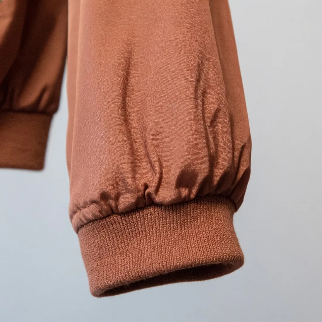 Detail shot
- A detail shot is a close-up of one part of a finished product, with its seams, edges and form. A swatch image shows flat cloth apart from any garment, so it contains no stitching and no shadow of a fold.
- Line sheet
- A line sheet is the ordering document of a collection. Swatches appear on it as small chips next to each style, where they stand for the colours and cloths a buyer can order.
A checklist for a fabric swatch image
- The cloth lies flat and without creases, and it fills the frame or shows a cleanly cut edge.
- Every swatch of the set was photographed from the same distance, so that weaves and patterns can be compared in size.
- A pattern runs in the direction it has on the finished product, and the nap of a pile fabric lies the same way in every picture.
- A black swatch looks black and a white one white, and the weave is still visible in both.
- The colour of the image was compared with the physical swatch in daylight, not only judged on one screen.