Keeping a collection grid even
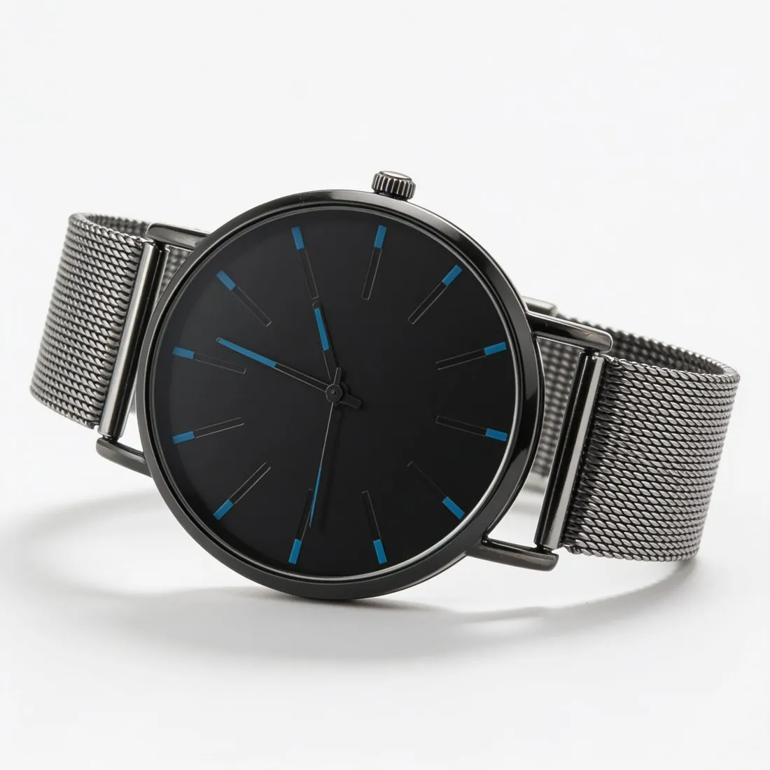
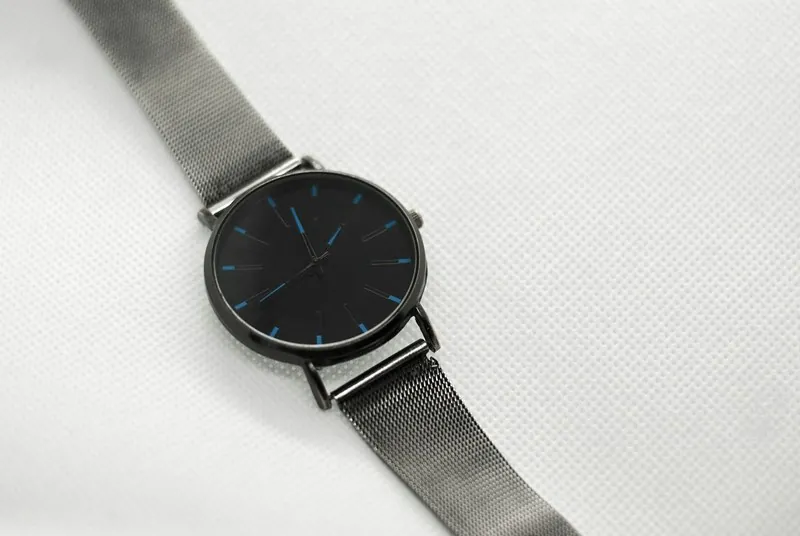
Shopify advises using one aspect ratio for all featured images, so that they display at the same size. A collection page that mixes square, portrait and landscape photos shows rows of uneven cards. Choosing the ratio before the first photo is taken, and keeping the product at the same position and margin in every frame, avoids recropping later.
Square at 2,048 × 2,048 pixels is the size Shopify recommends for square product images. A portrait ratio can suit clothing on a model, but then every featured image in the store has to follow it. The same background and lighting across a range make the grid read as one catalogue rather than a set of separate uploads.
Choosing between PNG and JPEG
Shopify ranks PNG first for most product images, followed by JPEG, and accepts TIFF, BMP, GIF, SVG, HEIC and WebP as well. PNG keeps flat colours and hard edges sharp, which suits packshots on a plain background and images with transparency.
A detailed photograph saved as PNG can become very heavy. Files must stay smaller than 20 MB and at most 5,000 × 5,000 pixels or 25 megapixels, but a lighter file also loads faster on a phone. For photographs with soft gradients, such as fabric or skin, a high-quality JPEG is usually the practical choice.
Room for zoom and detail
A square image at 2,048 × 2,048 pixels gives shoppers enough resolution to look closely at texture and stitching. The product should fill most of the frame with an even margin: a small product in a large empty frame wastes those pixels, and a product touching the edges looks cropped on the collection page.
Beyond the main image, a set usually covers the back, a side view, a detail of the material or hardware and the product in use. Animated GIF and WebP files are supported and can show a product turning or opening, but each animation adds weight to the page, so one per product keeps the page light.